Depending on where you live in the world, you might see an “old fashioned” cash register only occasionally. By “old fashioned” we mean no digital screens—except maybe a calculator.
Plenty of retailers now use a digital point-of-sale (POS) system with a screen that displays the scanned products and running subtotal, and usually options for manual product entry.
Many retailers—small business owners in particular—might not take into account their POS system design. In this guide, we’ll cover the importance of design in mobile and desktop POS systems and interfaces, as well as design elements specific to each platform.
The importance of design in mobile and desktop POS systems
First, let’s discuss the three main reasons why design is a significant factor for any POS system, on both mobile and desktop: better user experiences, faster transaction speeds, and consistent branding.
Better user experiences
The users of your POS system—most likely a store owner, manager, and/or employees—must be able to operate it easily and efficiently.
A badly designed POS system creates friction and confusion, leading to a poor user experience (and likely, a frustrated, waiting customer). On the other hand, a well-designed POS system can help store staff navigate important information, like a POS loyalty program, without keeping customers waiting.
Faster transaction speed
A well-designed POS system can help you move through customer transactions quickly. For example, having all the key transaction information laid out on one side of the screen and actions the staff member can take, as well as customer information (if applicable), on the other side, can reduce the click-paths for completing an interaction.
Consistent branding
You want a POS system that keeps your branding consistent across the customer journey. A good in-person POS system can print receipts with your brand’s logo, and perhaps even other on-brand messaging.
If you’ve mixed and matched your POS system from various POS companies, you won’t be able to deliver a consistent brand experience to your customers.
Design elements of desktop POS systems
A “desktop” POS system doesn’t necessarily mean a desktop PC running Windows or macOS. It means a point-of-sale system that is stationary, usually with a POS terminal that sits on a countertop alongside other devices, like a cash drawer, receipt printer, or barcode scanner.
Desktop POS systems vary in cost, so it’s important to find a system that is well-designed and fits your needs. There are three factors to consider: UI design, hardware design, and software design.
User interface (UI) design
POS user interface (UI) design is one of the underrated elements of POS systems. An effective UI design makes it not only more enjoyable to use, but training employees on a new POS is much easier if the UI is well-designed.
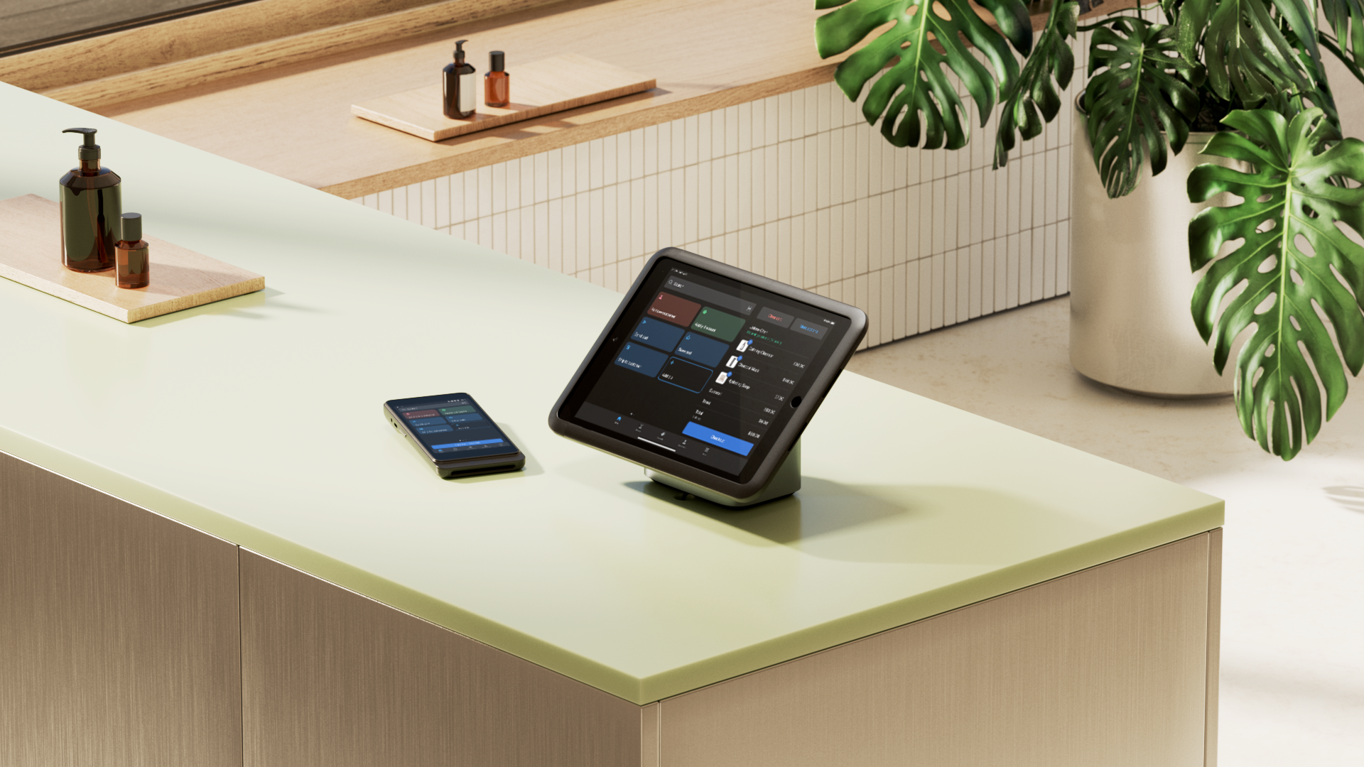
Part of what makes a POS UI design effective is an intuitive layout. Staff need to be able to find information and take the most frequent actions in as few clicks as possible. With Shopify POS, for example, store owners and operators can use the smart grid to customize their POS solution with apps, or create custom solutions with Shopify Partners.
“We actually moved all 15 of our stores to Shopify POS in less than three months, including training the team,” says Julia Rossi, Retail Operations Manager at Frank And Oak. “Shopify has great training resources, and the POS interface was easy for our store associates to get accustomed to.”
Hardware design
The physical aspect of desktop POS systems is important—you need to know if you have enough space in your store, as well as consider the usability of the system.
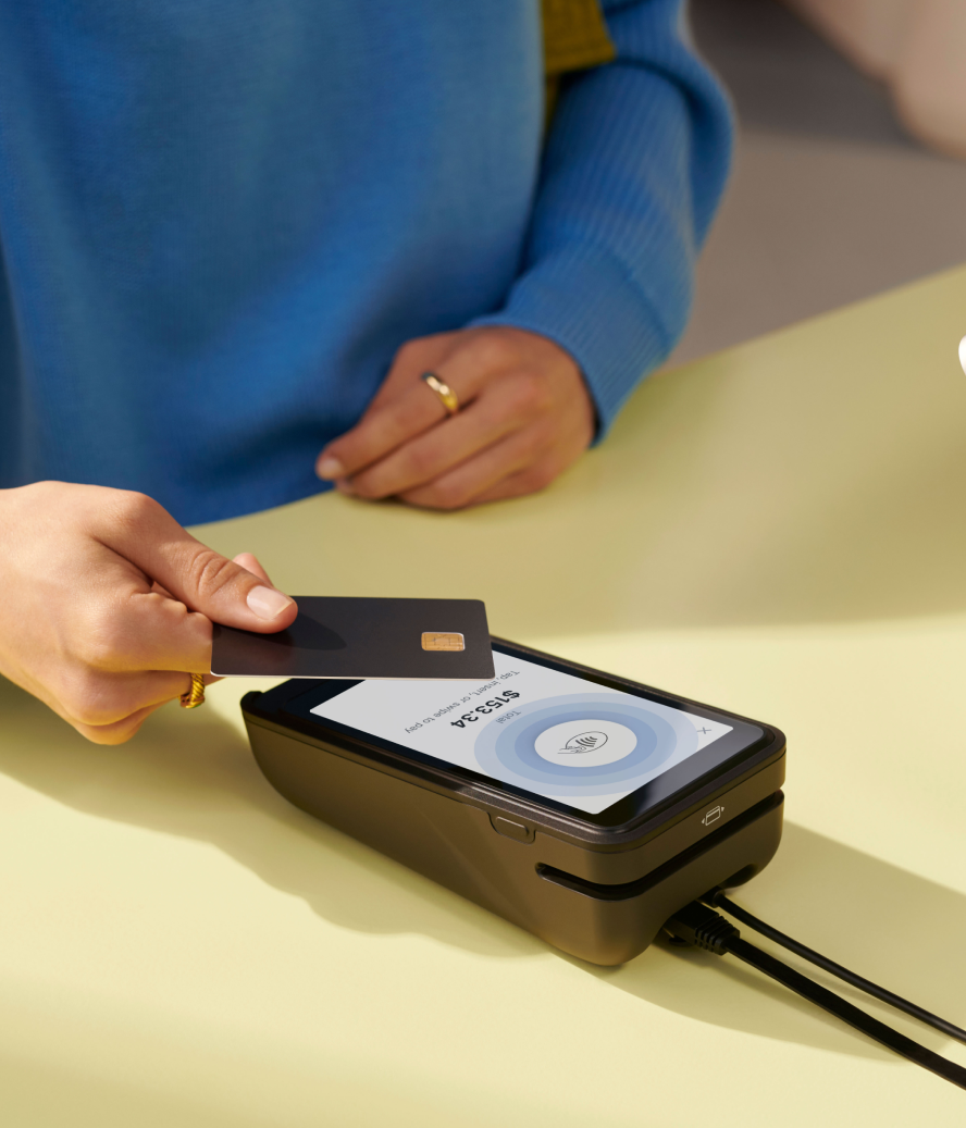
POS hardware comes in all sorts of shapes and sizes, and with POS terminals, you want to take up the least amount of space while still having a screen that’s functional as a terminal, no matter who uses it. You also need to consider your terminal’s integration with peripheral devices like receipt printers, scanners, and card readers.
As an example, Shopify’s POS hardware offers a range of sleek, modern POS terminals that take up little countertop space while being highly functional, integrated devices part of a complete POS hardware system.

Software design
The last main factor of desktop POS design is the software. Not too dissimilar from the principles behind great UI design, overall software design also includes the back-end development and available features.
So, beyond creating a user experience based on ease of use, POS software should also incorporate visual feedback on actions the user takes (i.e., interaction design), as well as POS integration design to allow store owners to further customize their POS solution and reduce cognitive load on staff.
For example, Shopify POS offers integrations for loyalty programs, UI extensions for stackable discounts, Zapiet for delivery and shipping, Ordergroove for subscription functions, and more.
Design elements of mobile POS systems
In mobile POS design, the same three design elementsapply: UI design, hardware design, and software design. Because mobile systems and desktop systems are different platforms, however, you should consider them separately.
User interface (UI) design
With mobile POS user interfaces, the obvious challenge with UI design is the smaller screen. Your device and display don’t offer as much in the way of screen real estate, so every part of the POS user interface matters that much more.
Include a hamburger menu for navigation—this is one of the most common methods of navigation on mobile devices. Secondly, have a navigation bar along the bottom, and a search bar at the top, which again, is a natural mobile navigation design that won’t be hard for staff to learn.
This design system won’t work without touchscreen optimization, since mobile-based POS systems rely on devices with a touchscreen. Touchscreen optimization includes clickable buttons not being too close together and smooth touchscreen typing functionality.
Lastly, consider consistency across devices, especially if you’re using both a mobile POS interface and a desktop POS (e.g., you have floor staff and counter staff for processing payments). Shopify POS, for example, has a consistent UI design whether you’re using a Shopify terminal or the POS app for mobile.
“Teaching new staff how to use Shopify POS is really easy,” says Sophie Rankine, co-founder of elph ceramics .”It makes onboarding new staff less stressful since it’s so simple to look up products and prices, check in-store pickups, and process sales.”
Hardware design
Mobile POS hardware design is also different from desktop given that the main goal is to be able to move around with it freely. As a result, the biggest factors in the context of mobile POS hardware design are portability and ergonomics.
The mobile POS system needs to be small and light enough to carry with one hand (while the other uses the screen or handles products), tough enough to withstand bumps and short drops, and have features you need to process your customer’s preferred card-based payment methods.
Depending on your choice of POS service provider, you may be using a tablet or a mobile phone as your POS tool. In either case, the POS hardware needs to be integrated with whichever device you prefer (e.g., iPads, iPhones, Android tablets, or other mobile devices).
Software design
The priority when designing any type of software interface is ease of use. With mobile apps, store owners have the opportunity to offer users (i.e., staff members) great visual feedback and interactions, as well as custom screen transitions that help create a memorable user experience.
Furthermore, software development updates offer your store better POS security, helping you avoid hackers, as well as specific features that limit staff member access and capabilities. You can get all of these features and more with the Shopify POS app, which can help you turn almost any mobile device (iOS and Android) into a point of sale.
Switch to a consistent and effortless POS system for your store today
Choosing a POS system based purely on pricing is a mistake that likely will cause you trouble in the future—from low-quality hardware to a lack of integration with your store and marketing apps, chances are you’ll spend more money in the long run.
Considering the POS design principles we’ve discussed above, you should now have a much better idea of the criteria to consider when you’re shopping for a POS system for your business. In addition to price, there’s usability, hardware and software integrations, consistent experience, ease of staff training, and customization.
POS system design FAQ
What is POS system design?
POS system design refers to the process of combining point-of-sale hardware and software solutions that make up a whole system facilitating sales transactions for businesses.
How do you create a POS system?
You can create an integrated POS system with a variety of hardware tools. The core equipment you’ll typically need includes a terminal, a barcode scanner, a card reader, and, if you accept cash, a cash drawer. Creating a POS system can be as simple as downloading a POS app to your phone and pairing it with a Bluetooth card reader.
What is the structure of a POS system?
The structure of a point-of-sales system includes both hardware and software components that work together to make day-to-day customer transactions run smoothly and collect data that helps manage your business, providing daily, weekly, or monthly reports on various areas, such as sales and staff performance.
What are the three types of POS?
There are lots of different POS systems, but the three most common include a desktop/countertop POS, a handheld POS, and a mobile-app-based POS.


